August 5, 2024No Comments

How I Used AI to Create My Portfolio

Creating a portfolio? Piece of cake, right? Well, not always. This time, I made it a fun AI-powered adventure!

The Journey Begins

First off, I had ChatGPT help me whip up some structure for my portfolio. It took a few iterations, but after some refinement, I arrived at a structure I liked. I quickly filled in the details to avoid overthinking – because, let's face it, perfection is the enemy of done. Then I asked GPT to organise the information and give it a consistent style.

Design Fun with AI

I dabbled with a bunch of AI design tools. I used Khroma to define the colour palette. It asked me to choose about 50 different colours, which by the end, all looked the same. The palettes it gave me were pretty but didn’t feel usable for my portfolio.

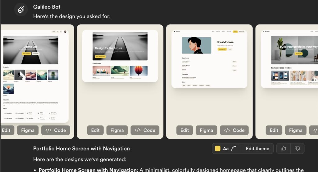
I turned to Galileo AI to see if I could get better results from a tool focused on UI design. My prompt, which I designed with the help of GPT, was:

"Create a colourful and minimalist flat design for a portfolio website. Use a clean, modern aesthetic with ample white space to ensure readability and ease of scanning. Incorporate bright, engaging colours that align with a professional yet approachable tone.”

The results weren’t great. Even after a few refinements of the prompts, I kept getting very basic page templates that didn’t meet all my requirements. For example, the case study page, which should have a few placeholders, just came up with a few images.

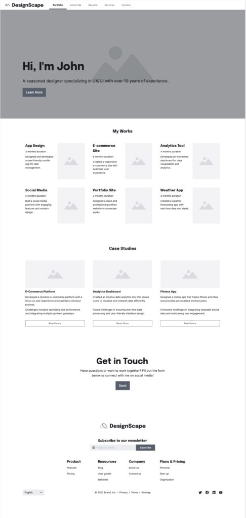
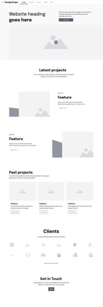
So I turned to Visily. The results were much better. It still wasn’t exactly what I wanted, but it gave me a good starting point for structure and ideas. I refined the wireframes manually - nothing like the human touch! - and was quite pleased with the results. I tried using the AI feature to turn the wireframes into visuals but wasn’t convinced by the result.

Done by Visly AI

Done by me

But I still had the issue with the visual identity of my site. I’ve never been one for branding, so I was very excited when I found WIX, a saviour for colours and logos. WIX really understood the identity I wanted to convey and gave me a few different options for logos and colour palettes, which I ended up using in my final design.

I used Figma to collate the wireframes, colours, and logos and created the design there. I then moved to Semplice to hand-build my site.

Picture Puzzles

As I mentioned before, I’m not great with visuals, so I hoped I could use AI to create interesting image compositions for the assets I had to present in my portfolio. I tried different tools: Canva, Mixart AI, ImageMixer… but alas, I couldn’t find a tool that would put my screenshots on a phone that someone is holding (I don’t have Photoshop and even if I did, I’m terrible at it). I spent a whole afternoon trying to find the right tool but didn’t. If you know of any tools for this, give me a shout!

I created some basic layouts on Figma to present my images. There aren’t that many anyway… you may relate to this, fellow designer: I’m terrible at keeping documentation of my work!

Video Adventures

With my design, content, and images lovingly placed on my site, I decided to create an intro video for my portfolio, possibly to account for the lack of images everywhere else.

I found a few tools, but the one that brought me closest to my goal was InVideo. I used several prompts and iterations to create what I wanted but found many issues.

First, it always attempts to use stock imagery, even on the free version! I had my images and wanted an easy montage, but it kept adding random images with self-created prompts: “professional woman introducing herself on camera, female designer speaking directly to the camera, experienced professional in a modern office setting”. I would never use that for a video of myself!

Second, the default format is portrait, as this is a tool more useful for Instagram and TikTok.

Finally, it gets confused with detailed instructions. The best result I obtained was my first attempt with this prompt:

“Create a 15-second video that summarises my portfolio. The script should talk about my experience working across the different projects and companies in my portfolio. The portfolio is in www.dianamundo.com"

The result

“Create a 15-second video that summarises my portfolio. The script should talk about my experience working across the different projects and companies in my portfolio. The portfolio is in www.dianamundo.com"

Once I provided a very detailed prompt, it freaked out and created a video with stock images only and a very random script without any of the information on my website.

Here’s the polished prompt I used:

“Create a 15-second landscape video using this script:

- [Scene 1: Dynamic intro with name and website]
  * Text: "Hi, I'm Diana Mundo - dee-ana - an experience designer with over 12 years of experience”
  * Visuals: Bold text overlay, website URL at the bottom
  * Colours: Background #F95B3D, Font #FFFFFF

- [Scene 2: Highlight diverse projects]
  * Script: "Explore my portfolio of innovative projects and collaborations."
  * Visuals: Quick slideshow of images in www.dianamundo.com
  * Colours: Background #E7E9F5, Font #270949

- [Scene 3: Showcase project highlights]
  * Script: "From interactive media solutions to creative tech integrations."
  * Visuals: Eurosport images and a piece of the video https://vimeo.com/105921539
  * Colours: Background #F95B3D, Font #FFFFFF

- [End screen: Encouraging exploration]
  * Script: “Start browsing and get in touch for more”
  * Visuals: Website URL prominently displayed
  * Colours: Background #F95B3D, Font #FFFFFF.

All information and images should come from www.dianamundo.com.”

The result

Despite refining, InVideo just didn’t cut it, so I jumped ship to Canva. With GPT’s script and Canva’s cool templates, I finally nailed a video that felt like me.

Wrapping It Up

Mixing AI tools with my creativity was a wild ride, but I’m thrilled with the outcome. With a bit of AI magic and a lot of patience, I crafted a portfolio that’s not just presentable but genuinely engaging. Sure, it was trial and error, but it was way more fun than stressful.

My takeaway is: AI still isn’t coming to take my job. GenAI has advanced so much in the past few years but is still far from done. It gave great ideas and inspiration and definitely accelerated a process that is normally painful. I’m even writing this post with the help of GPT (my new best friend).

Give it a shot and make your portfolio journey a playful one!

Want to check out my portfolio? Visit www.dianamundo.com.

August 9, 2018No Comments

Senses, emotion, and presentations

Photo by Mikael Kristenson on Unsplash


In my previous post, “Let’s get physical! — physical presentations” I wrote about the importance of using presentation materials that use multiple senses. In this post I’ll dig deeper into the importance of each sense in the levels of emotional engagement and the creation of memories.

To understand how our senses influence the our memory, it’s helpful to talk about how memories are stored in and retrieved from the brain. Human memories are scattered across the brain, with different parts of the brain being dedicated to specific types of information. For example, visual information is processed in the visual cortex, in the occipital lobe, whereas sound is processed in the auditory cortex, in the temporal lobe. At a high level, when we recall a specific memory, the different parts of the brain that contain pieces of the memory are activated and the hippocampus compiles all the information into one distinct memory.

Everyday our senses fill us with information about our environment and situations. We process information at different levels and we store what is meaningful in our long-term memory. The information stored in the long-term memory is what we normally call “memories”. Emotion is one of the main factors in the creation of memories. For example, we remember better those events that are emotionally charged and we remember positive memories for longer.

Below, I’ve compiled some high-level information around the interactions between our senses and emotion.

Smell

Photo by Sergey Shmidt on Unsplash


Smell, or olfaction, is the perception of chemicals in the food or floating in the air through receptors in the nose. The information captured by the receptors is then processed by the olfactory bulb in the frontal cortex and sent to different parts of the brain.

Smells create extremely powerful memories. Olfaction is known to be closely related to the memory, and the links created by smells survive in the memory longer than any other sense. “Memories of images begin to fade days or even hours after viewing, whereas recall of smells remains unimpaired for as much as a year” (‘Link proved between senses and memory). Due to their long lasting effect, a specific smell can trigger old memories that we didn’t know we remembered, in an instant.

Smell is a big aspect in branding and product, for example, past studies demonstrated that scented machines in a casino attracted 45% more people than unscented ones. Also, brands like Abercrombie and Massimo Dutti incorporate smell as part of their brand identity.

Controlling the smells during your presentation can trigger a better emotional response to your speech and improve memorability. Consider the type of product you’re presenting, how it relates to the audience, and how you can use smell to reinforce your message. Or maybe just spray a nice, soft scent to set people in the right mood.

Touch

Photo by Yoann Boyer on Unsplash


Touch, or somatosensory perception, happens through the activation of receptors present in the skin. Sensations can appear from pressure, temperature, or pain. The information gathered travels through the peripheral nervous system, to the central nervous system and the brain.

Touch is the first sense to develop in children and it remains the most emotional throughout our lives — we are able to distinguish the emotional state of another person based on the way they touch us. It is the sense that is most linked to our body, and the one that allows us to affirm our emotional connection to others as well as the connection from others to us. Physical proximity and touch are signs of trust, and more physical proximity increases that trust. For example, people are more likely to purchase items in a store if they can touch them, and to feel a stronger affinity for brands with which they‘ve had a physical interaction.

Touching a product allows us to identify characteristics about it such as weight and texture, and this lets us to judge the quality of the product. It also allows us to look at it from different perspectives and feel related to it.

With a physical presentation you can let your audience touch it, interact with it, maybe change some things in it, and add their own ideas. It will make them feel closer to it, creating an emotional connection that will help them remember your message more accurately.

Taste

Photo by Brenda Godinez on Unsplash


Taste, or gustation, is the detection of chemicals through the taste buds on the tongue. We can identify 5 different basic tastes that combined, they create what we know as the flavour. Flavours influence our brain in multiple ways: sweet, savoury and salty foods influence moods, emotions and memories, whereas bitter flavours tend to make us move away or even gag. Therefore, when we see our favourite ice cream, our brain links the taste with the happiness it creates making you drool, or when we taste something rotten we feel the urge to vomit.

You can take full advantage of the emotional connections of taste in presentations by, for example, providing catering that appeals to the audience, with a variety of flavours they can associate with positive emotions researching your audience’s food preferences to ensure everyone’s needs are met; taking into account the weather and season; etc. However, if you can’t have catering, bring some biscuits or fruit to the room, and people will be much more open to hear what you have to say.

Sight

Photo by Eric Ward on Unsplash


Sight, or vision, is the ability to process light to perceive images. Light enters through the pupil and is focused in the retina, where the photoreceptors generate nerve impulses that are sent to the occipital lobe in the back of the brain.

Sight is the first sense we use to categorise emotions. We’ve all heard the saying “an image is worth a thousand words”, it means we can acquire a large amount of information from details in a picture based on previous experiences and knowledge, and we can even feel identified with the situation. We recognise an immense variety of things in an image like face expressions, body language, weather conditions, shapes, colours, danger, etc; we know if a situation is pleasant or unpleasant and we can be emotionally affected by simply looking at a picture. Essentially, what we see affects how we feel.

The visual aspect of presentations has been largely discussed in the past years. The use of Powerpoint slides became mainstream many years ago and a lot of research has gone into that field, with key recommendations around avoiding long chunks of text and too many bullet points; using related, high-quality images; limiting the use of animations and ppt templates; knowing your charts, colours, and fonts; and using video.

All these principles can and should be applied to any other presentation material you decide to use. The visual aspect of any material you use should be carefully crafted, as any unattended detail will divert the attention of the audience (just like a low-resolution image would on a slide). Also, colour theory, font sizes, and image quality should be considered to make sure that everyone can see and enjoy the materials you are presenting.

Hearing

Photo by Samuel Dixon on Unsplash


Hearing, or audition, is the ability to process air vibrations into sounds. Humans can detect a range between 20 and 20.000 Hertz. Information related to sounds is processed in the auditory cortex, in the temporal lobes of the brain.

Sounds create powerful emotional connections, from feeling happy when you hear the voice of a friend whom you haven’t spoken to in years, to nostalgic when you hear a song from your youth, or scared when you hear the hissing of a snake. Sounds have the ability to attract our attention, keep us focused, and awake in us all sorts of feelings.

During presentations, the obvious use of sound is through speech. Speech is a powerful tool that, managed properly, allows you to keep your audience’s attention. There is a lot of research about speech in presentations, but in general, it helps to have changes in the volume and rhythm to emphasise specific words or phrases, to maintain a good volume throughout the presentation to ensure everyone in your audience can hear you, and to manage the timbre of your voice to accentuate emotions.

You can also use ambient sounds during a presentation to help your audience feel more connected to the topic you’re discussing — think of a movie, where ambient sounds help create the scenario, but don’t distract you from the conversation between the characters. For example, if you’re talking about an airport, it may help to use background airport noises to bring the space to life. Background music can also be effective to set an atmosphere in the place where the presentation is happening, just make sure it doesn’t compete with your speech.

By using materials that appeal to all the senses you’re opening the door to multiple types of emotional connection, and increasing the chances of your audience to engage and agree with you. You’re also improving the memorability and understandability of your presentation by activating different parts of the brain to communicate your message in the form of multiple sensations.

When you find yourself preparing your next presentation, consider carefully how you’re planning to manage each sense to create the biggest impact in your audience.

Thanks for reading! If you liked it, share it and keep an eye open for my next post.

June 5, 2018No Comments

Let’s get physical! — physical presentations

From a mountain in Andorra (photo by Dimitris Kontaris)


Our most powerful memories are those that involve more than one sense, in fact our strongest memories often come to us in the shape of multiple sensations

I’ll always remember 2010 New Year’s Eve dinner in Andorra, my mum and my sister were visiting, it was snowing and the smell of food was coming out of the door of the restaurant Tarragona. The lamb was so soft, you could shred it with a spoon; the wine was strong, the kind that smells so good that you almost don’t have to drink it to know what it tastes like; the air was humid, with all the windows closed, but the temperature was perfect.

That’s an experience! When we experience something with all our senses we tend to get more engaged emotionally.

As experience designers, emotional engagement is what we’re after when we create experiences, small or big, we want our customers, our audience to be engaged with what we do. This applies to everything we do: apps, websites, branding, emails, and the main focus of this post, presentations. Presentations for anyone, internal or external, short or long, so long as we need to keep our audience engaged, to agree with us, to remember us and our presentation.

If emotional engagement is stronger when we use multiple senses, why are we presenting using mainly screens and speech? There are a whole lot of other senses we can activate during presentations!

My hypothesis is: we can create more powerful, engaging presentations if we use alternative materials. Power Point and friends (Keynote, Google Slides, etc.) are great tools, but they aren’t always the right tool. However, nowadays, every time we hear the word “presentation” we think “slides”. It’s been a long time now since preparing a presentation means creating a bunch of slides filled with bullet points of the message we want to convey. And more often than not, we adapt our speech to the slides, not the other way around. Presentations are so much more than slides! We’ve forgotten that presentations are all about the story.

Defining the medium shouldn’t be the first thing we do when we’re preparing a presentation; there’s an order to things. For example, when you’re planning dinner, you make the food before you put it on the plates. It should be the same with presentations: you create the story you’re going to tell before you create the presentation.

Slides are one of the easiest solution, I get it, but that doesn’t make it the ideal way to present all your ideas. And even if slides are the best solution, jumping straight into Power Point to plan a presentation creates limitations and distractions on the story you’re trying to tell.

Storytelling presentation by Magda Maslach

Successful presentations

So let’s start from the beginning. What makes a presentation successful? Carmine Gallo, a business communication expert, explains that “successful presentations are understandable, memorable and emotional”.

“Successful presentations are understandable, memorable and emotional”.

To ensure understandability he recommends using the “Twitter-friendly headline” technique, in which you must describe the key idea of your presentation in less than 140 characters. Through this technique you ensure that you know exactly what’s the message you want to convey and you help your audience understand the topic better.

To make your presentation memorable, to ensure that your audience remembers what you said, Gallo recommends using the rule of three. Due to the limited capacity of our short-term memory (we can process between 3 and 7 items at the same time), delivering content in groups of three items helps people remember better. If you have more than three key things you want to say, consider grouping ideas and presenting them in three chunks.

Another trick for making your presentation memorable is using alternative materials. It’s a fact that our brains remember better the information that is processed with more than one sense at a time. For example, when studying for a test we’re more likely to remember if we read out loud than if we do it in silence, simply because our brain creates auditory links as well as visual ones — i.e. you remember reading it and hearing yourself saying it*. By using multiple senses we create more sensory links and memories are more likely to be stronger. Additionally, using materials other than Power Point will make our presentation stand out from the rest, and our brains remember the more unusual information best.

When studying for a test we’re more likely to remember if we read out loud than if we do it in silence, simply because our brain creates auditory links as well as visual ones.

Finally, Gallo stresses that the emotional aspect of a presentation is what encourages people to take action. The most common, and one of the most powerful ways to gain emotional connection is through storytelling. Our brains are wired for stories, we’ve been telling them for thousands of years and they still remain the most powerful way to convey experiences. Stories allow us to feel connected to the characters and understand their pain and struggle. When combined with data, stories awake two different parts of the brain, the logical part that processes the data and the emotional part that tries to recreate the feelings and sensations of the character.

I propose that we help our audience relieve those sensations through multi-sensory presentations, that we think about the most effective medium to communicate our message, the one that creates the biggest impact and not the one that is the easiest, most common one.

In the next few posts I’ll talk about the importance of multi-sensory experiences in memory creation and different approaches to creative presentations. In the meantime, here’s a list of of presentation materials that you might find useful for your next presentation.


Presentation materials

Props: Props help the speaker make a point concrete, have a stronger emotional impact, use effective metaphors, inject humour, focus the audience’s attention, and make the presentation memorable.

Scene setting: Creating a physical representation of the space that you’re talking about helps drive the conversation around the physicality of it. Additionally, it helps visualise different possibilities and secondary spaces that wouldn’t be seen in a bi-dimensional representation.

Scene setting example


Physical presentation: Print your presentation, make it a board, use it to drive a conversation around your story, rather than just presenting your point of view. General views of a journey can help clients and teammates visualise easier what you’re talking about as well as reduce their fear to talk about their ideas and concerns.

Role playing: Telling a story through role playing allows the listeners to feel more engaged with the action. There’s a massive difference between hearing the summary of a conversation and hearing the conversation itself, or hearing the summary of a person’s thoughts and hearing the thought process as it happens together with the action. Role playing allows the story to be told with the voice of the characters in the story.

Any other ideas you can come up with: Does it make sense to dance it out? Make a song? As long as you can produce a good fidelity presentation and the materials that you’re using reinforce your message.

Thanks for reading! Please comment, and keep an eye open for the next post.

References

*Memory Consolidation

Get in touch

Send me an email: hi@dianamundo.com or get in touch via LinkedIn