Eurosport
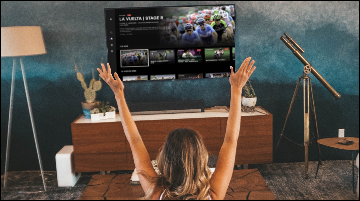
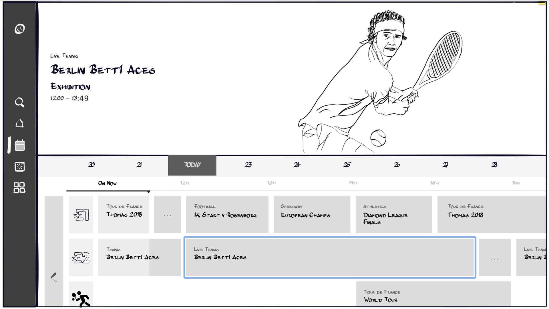
We redesigned Eurosport's TV app to enhance readability and navigation, creating a modern lean-back experience. The updated app was successfully launched on five platforms, including FireTV and Xbox.
We redesigned Eurosport's TV app to enhance readability and navigation, creating a modern lean-back experience. The updated app was successfully launched on five platforms, including FireTV and Xbox.
Project details
Overview
In 2020, the Eurosport TV app was outdated and provided a poor user experience, with issues such as illegible text and difficult navigation.
To address these problems, a comprehensive redesign was undertaken, involving three rounds of user research and two design phases, aimed at enhancing the usability and visual appeal of the app.
My role
Lead UX Designer. I was responsible for the overall user experience and managed the visual designer throughout the project.
Challenge
The primary challenge was to create a lean-back experience for Eurosport on all connected TVs, adhering to the new brand guidelines.
The goal was to ensure the app was modern, visually appealing, and easy to navigate, providing users with a seamless, lean-back viewing experience.
Solution
A refreshed app design that incorporated the following improvements:
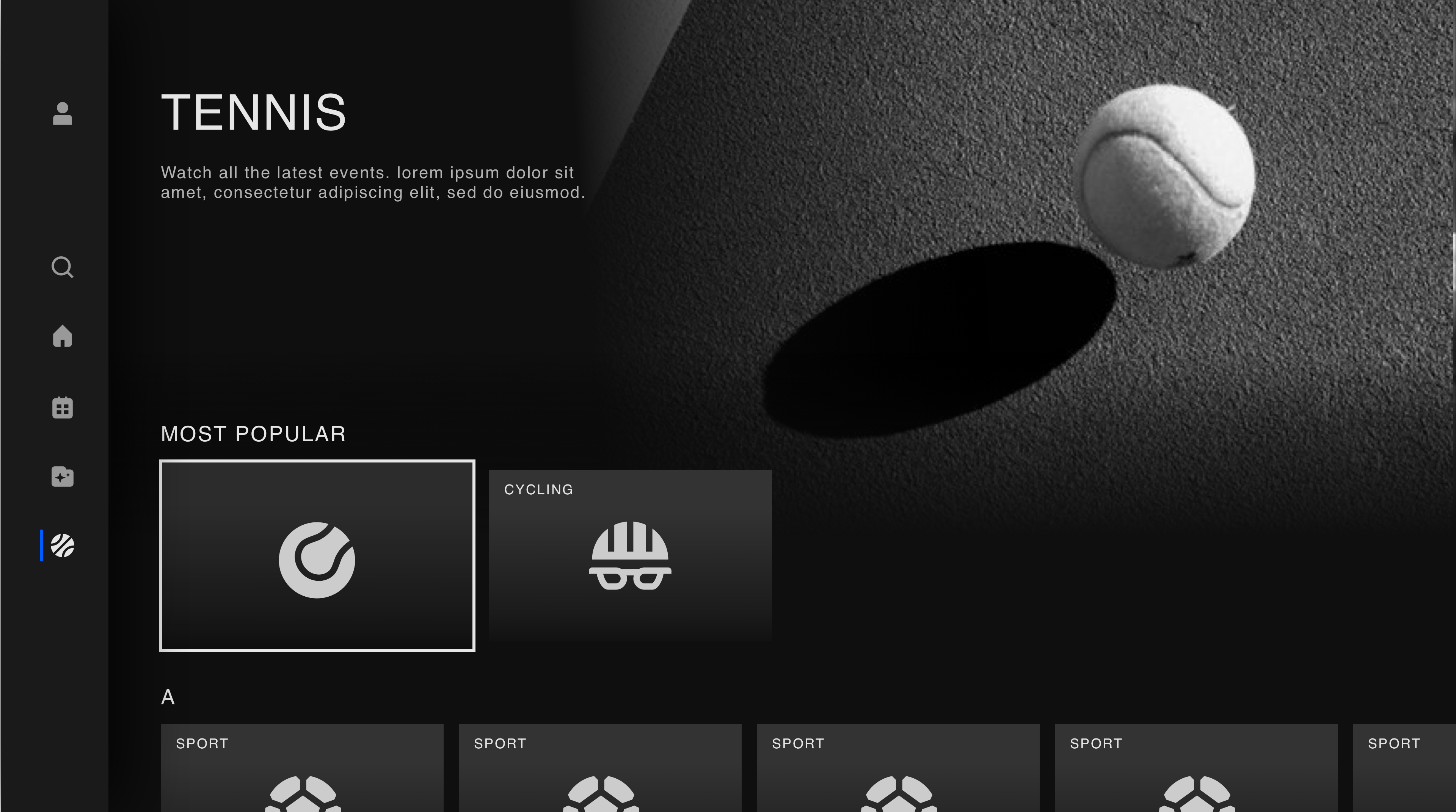
- Modern aesthetics: Updated the visual design to align with the new brand guidelines, making the app look modern and cohesive.
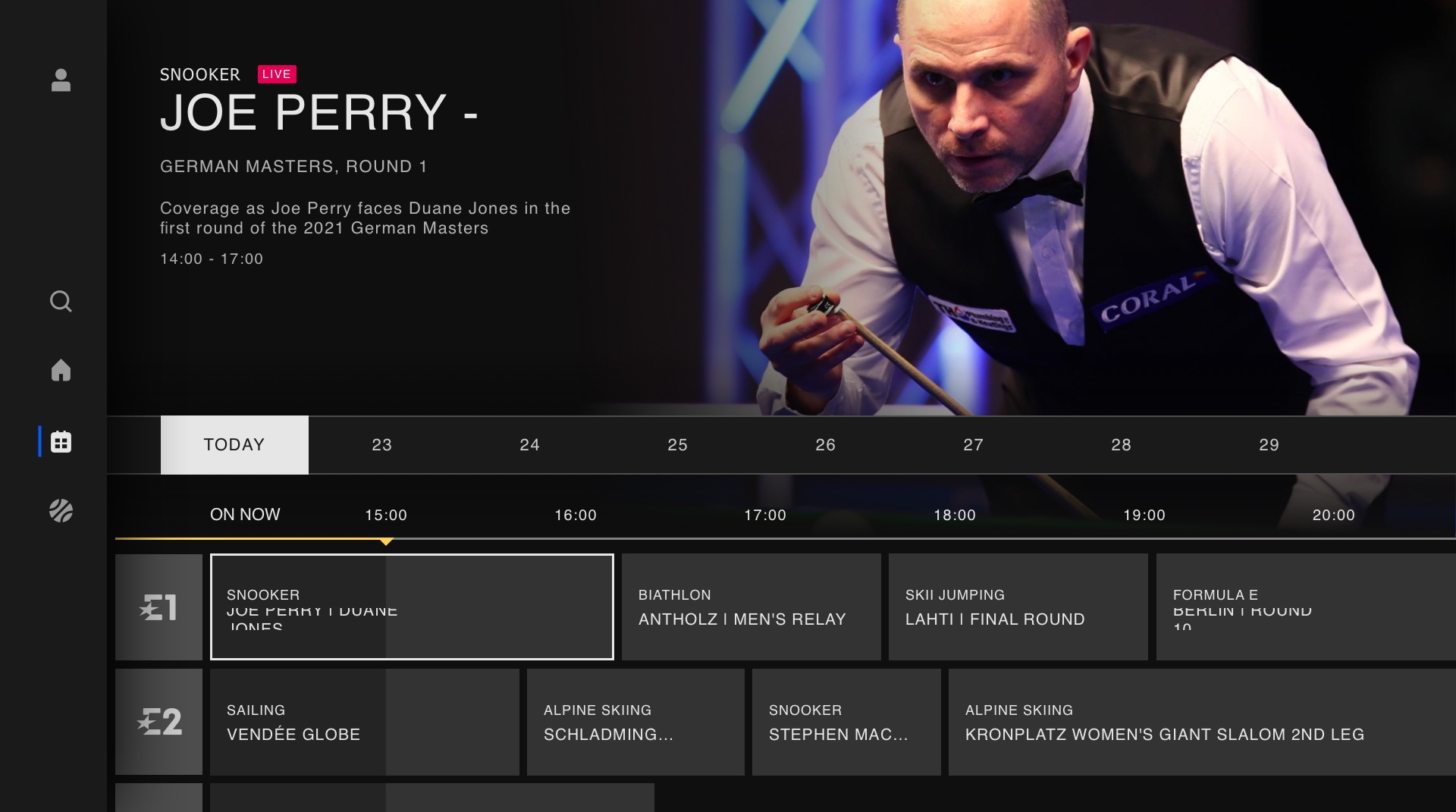
- Improved navigation: Simplified the navigation structure to make it easier for users to find and access content.
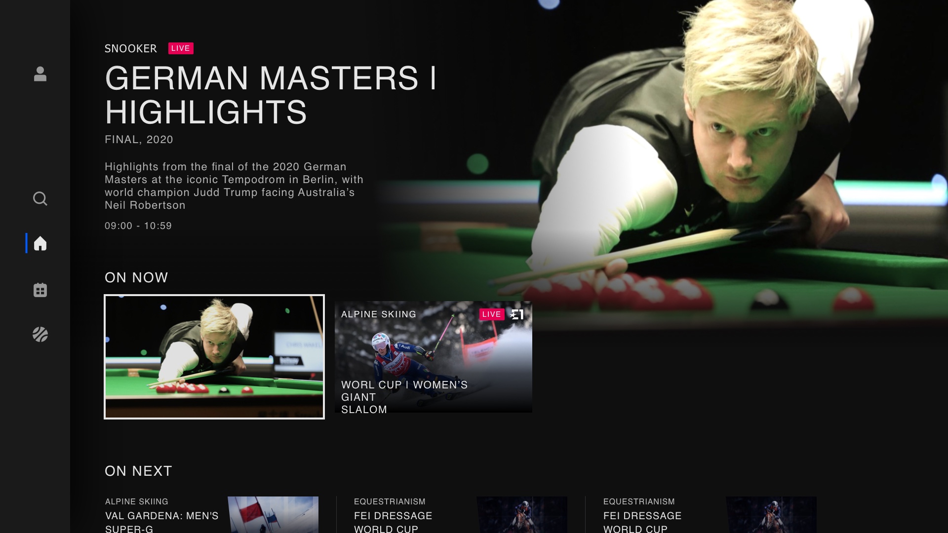
- Onward journeys: Introduced onward journeys to enhance the lean-back experience, allowing users to effortlessly continue watching related content.
- Enhanced legibility: Addressed issues with text legibility by choosing appropriate font sizes, colours, and contrasts.

Process overview
Process overview
Discovery
User research:
Kicked off the project with an initial round of user research to understand customer needs for a sports application on TV.
Desk research:
Conducted a competitor analysis of four leading TV applications in video content distribution: Netflix, Prime Video, Disney+, and All4. Reviewed interaction patterns, usability, UI elements, and overall user experience.
UX design
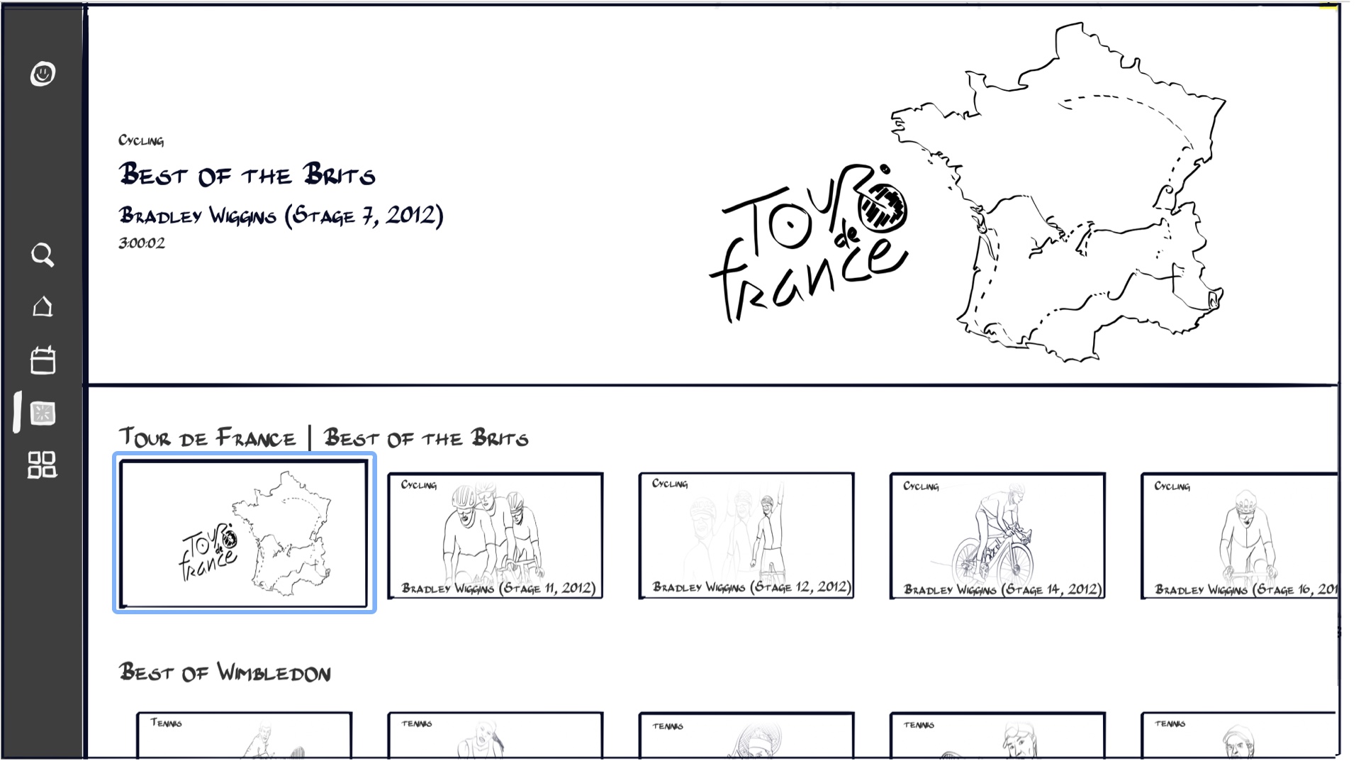
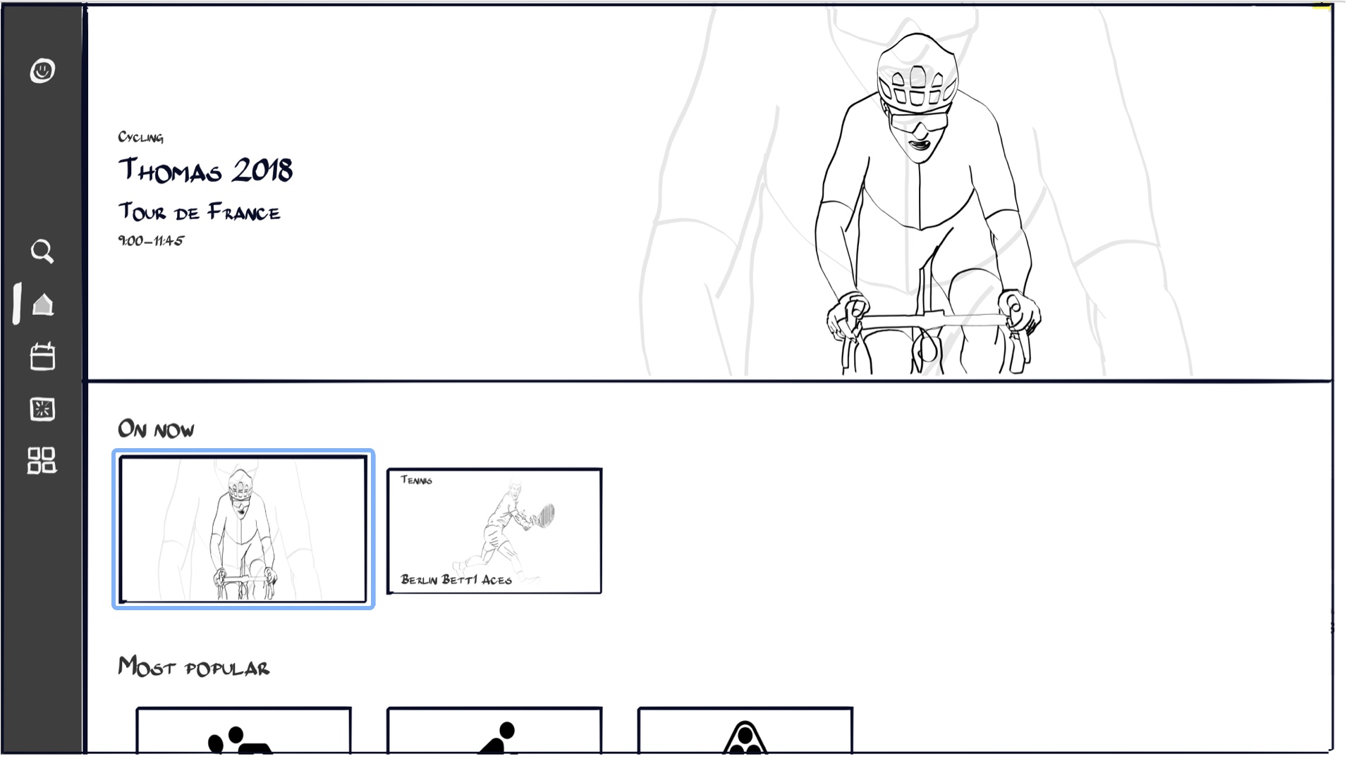
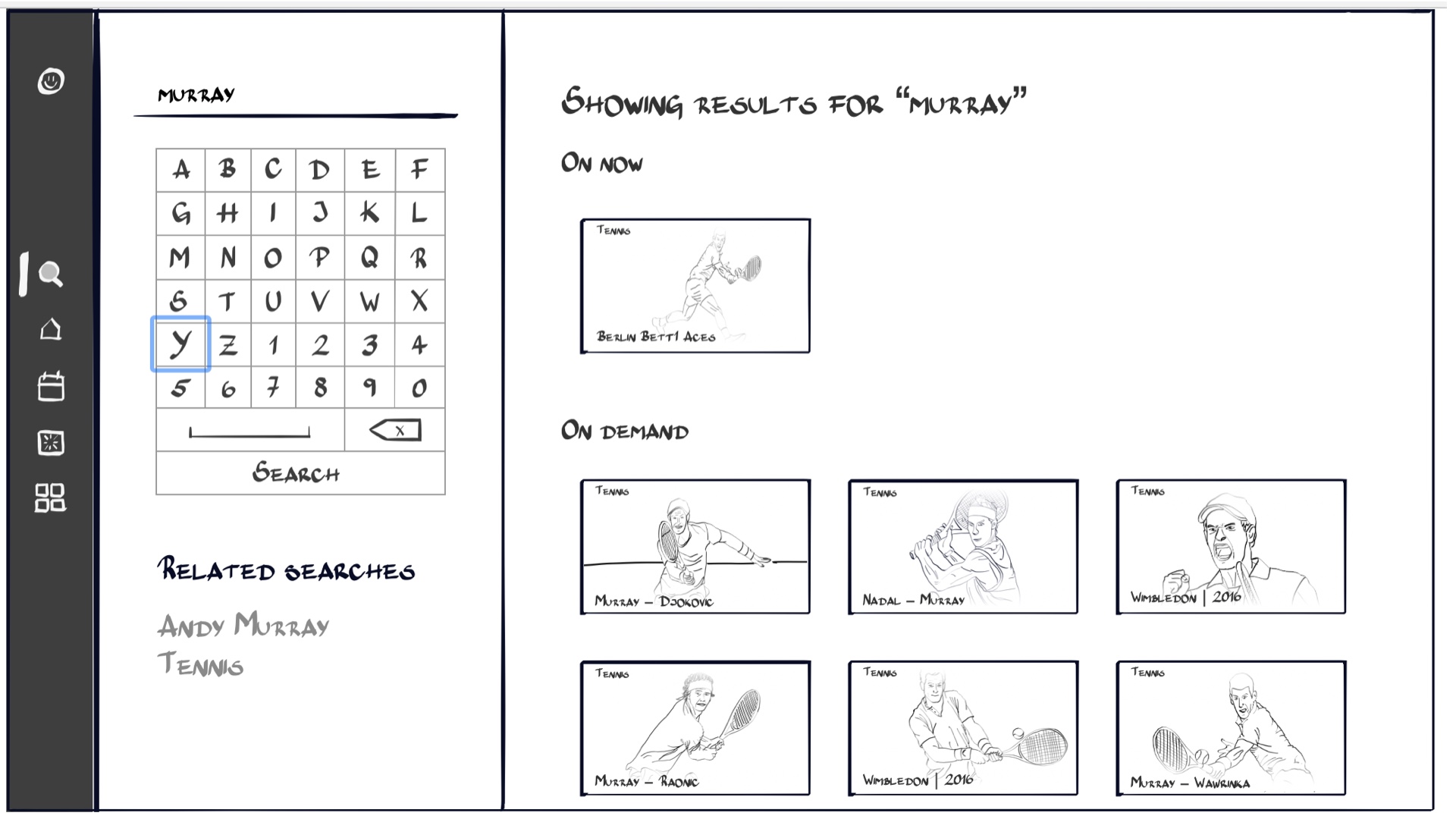
Low-fidelity wireframes:
Designed the initial concept using low-fidelity, hand-drawn wireframes to outline the basic layout and navigation flow.
Interactive prototypes:
Developed prototypes that could be navigated using a keyboard to simulate the experience of using a remote control instead of a mouse.
User testing:
Tested these concepts with users to gather feedback and identify areas for improvement.
Visual design
Iterative design:
Refined the concept based on user feedback and iterated on the design to enhance functionality and aesthetics.
Visual design: Created the high-fidelity visual design, incorporating the new brand guidelines and ensuring a modern look and feel.
Iterative design:
Refined the concept based on user feedback and iterated on the design to enhance functionality and aesthetics.
Visual design: Created the high-fidelity visual design, incorporating the new brand guidelines and ensuring a modern look and feel.
Testing
Usability testing:
Conducted a final round of testing to iron out any remaining issues and ensure the app met user expectations and usability standards.
Results
The redesigned app was successfully built in collaboration with a development agency and launched on five different platforms: FireTV, Xbox, PS4, Vodafone STB, and Samsung TV.
The new design significantly improved user satisfaction and engagement, as evidenced by positive user feedback and increased usage metrics.
Other projects
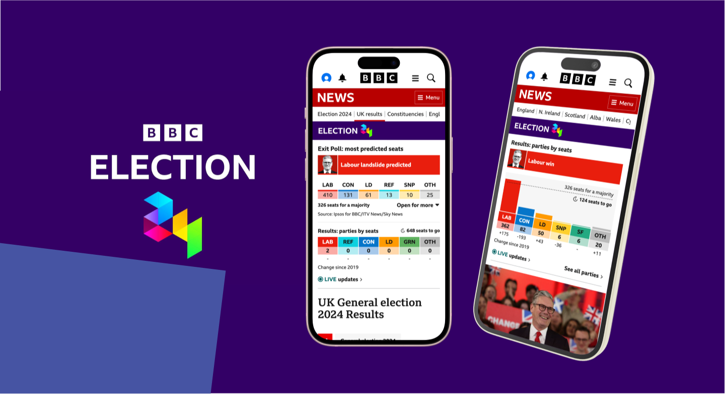
General Election 2024Responsive web
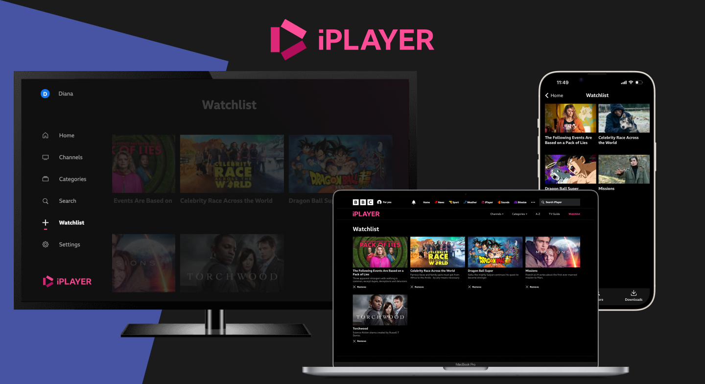
iPlayer - User lifecycleResponsive web
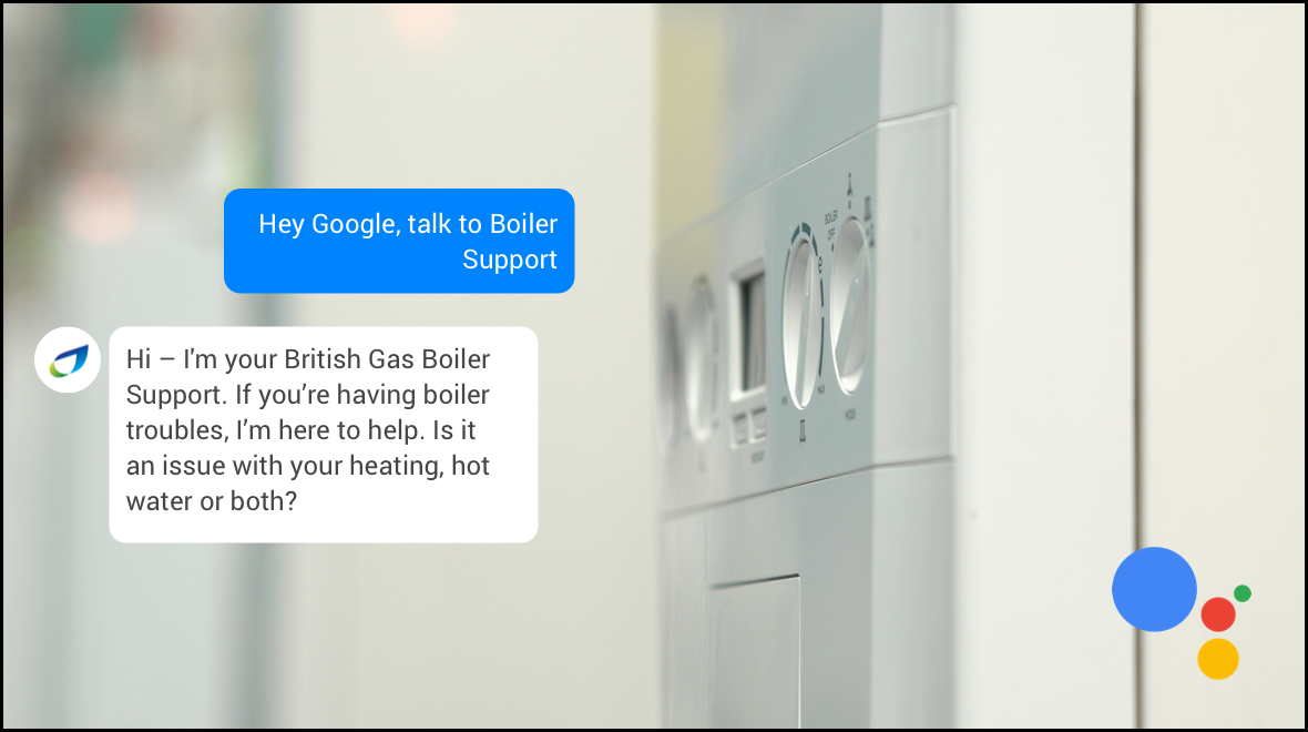
Boiler Support - British GasVoice UI

Fun projectsExperiential
Get in touch
Send me an email: hi@dianamundo.com or get in touch via LinkedIn